LEAD DESIGNER
Brand Identity, Web Design, Merchandise Design, Social Media Graphics
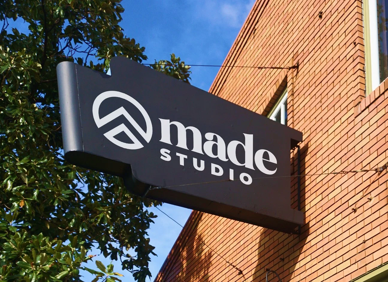
MADE Studio Rebrand
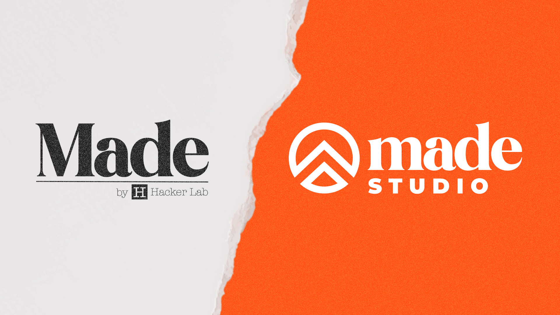
Old vs. New Logo
EVOLVING THE BRAND
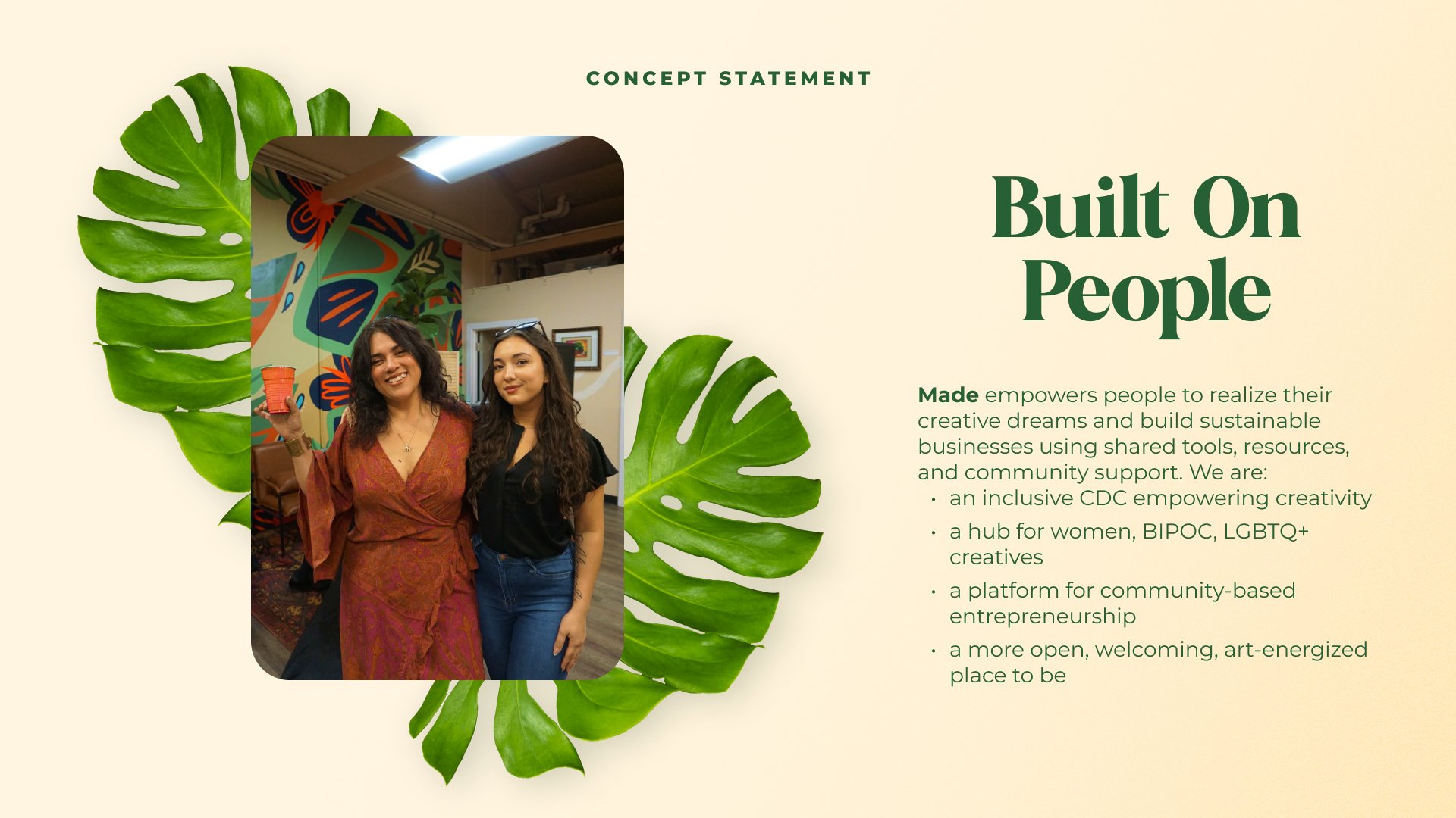
Made Studio is a creative fabrication space that equips makers, artists, and entrepreneurs with the tools, training, and support to bring their visions to life. With this mission in mind, the original branding was too stiff for Made’s creative and modular space. In addition, the logo still referenced “Hacker Lab”, an earlier incarnation of the space. We needed to craft a separate identity and find a look and feel that appealed to all the walks of life that come in and out of our doors. Ultimately, the change resulted in a multifaceted brand system that spoke to our members and set a precedent for what the studio could provide.
“Together, we’re building a vibrant hub where ideas flourish, skills grow, and diverse voices are celebrated.”
THE APPROACH
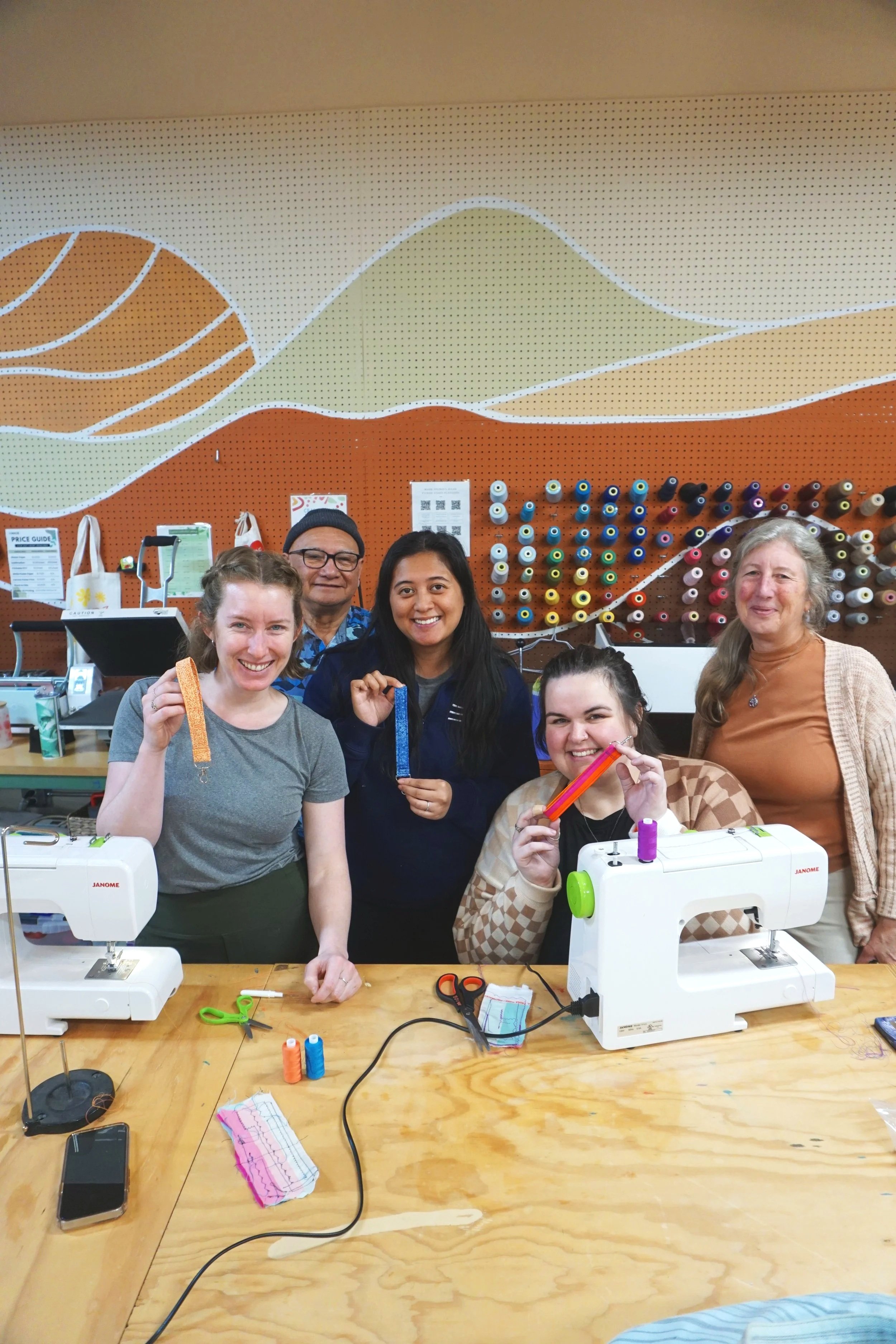
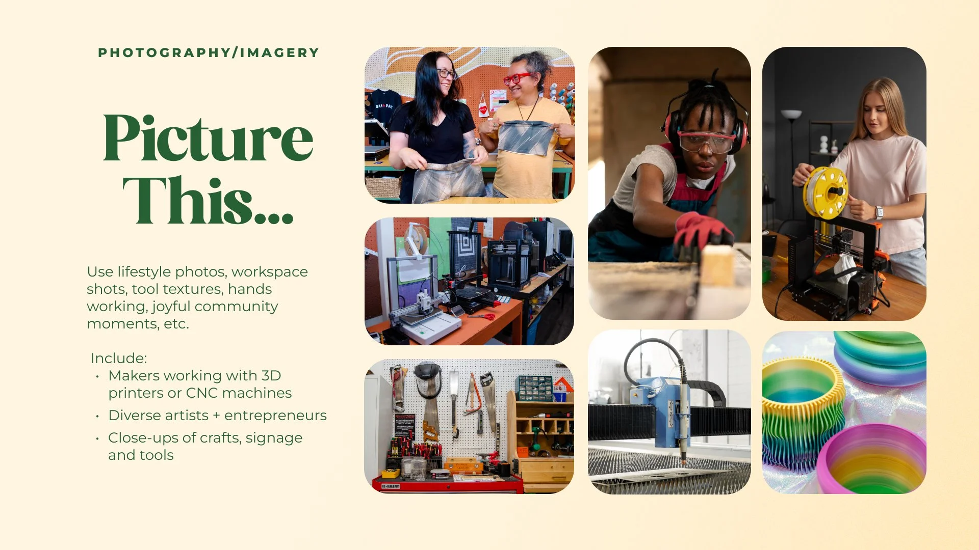
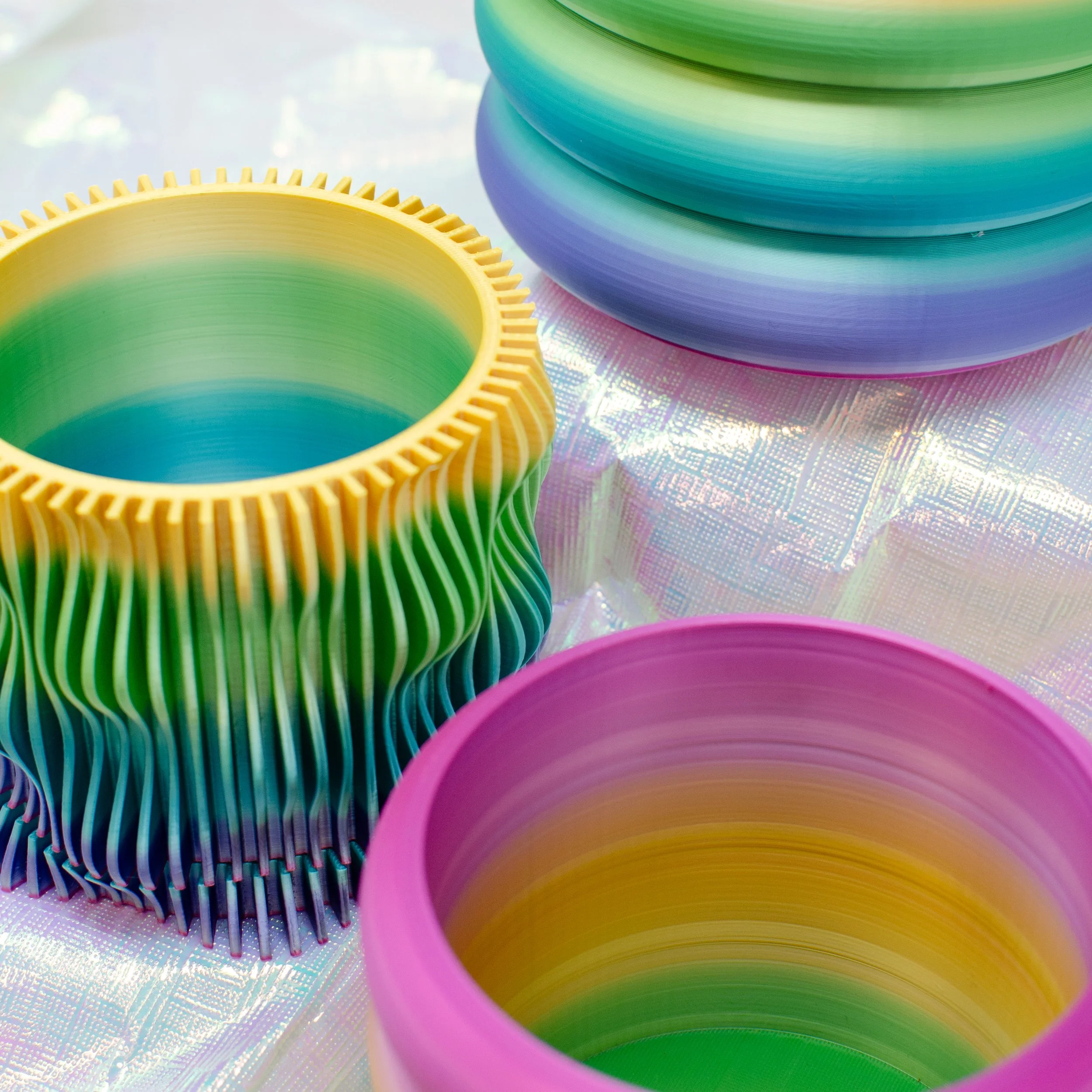
Rather than over-polishing the brand, I kept in mind that the studio’s main focus is giving the community tools and training to feel more capable in their creative endeavors. The studio’s transition from a nonprofit to a community development corporation (CDC) helped guide the creative choices made in the rebrand. I leaned into warm aesthetics, clear and accessible copy, and depictions of capable and confident entrepreneurs using the tools and services provided in the studio.
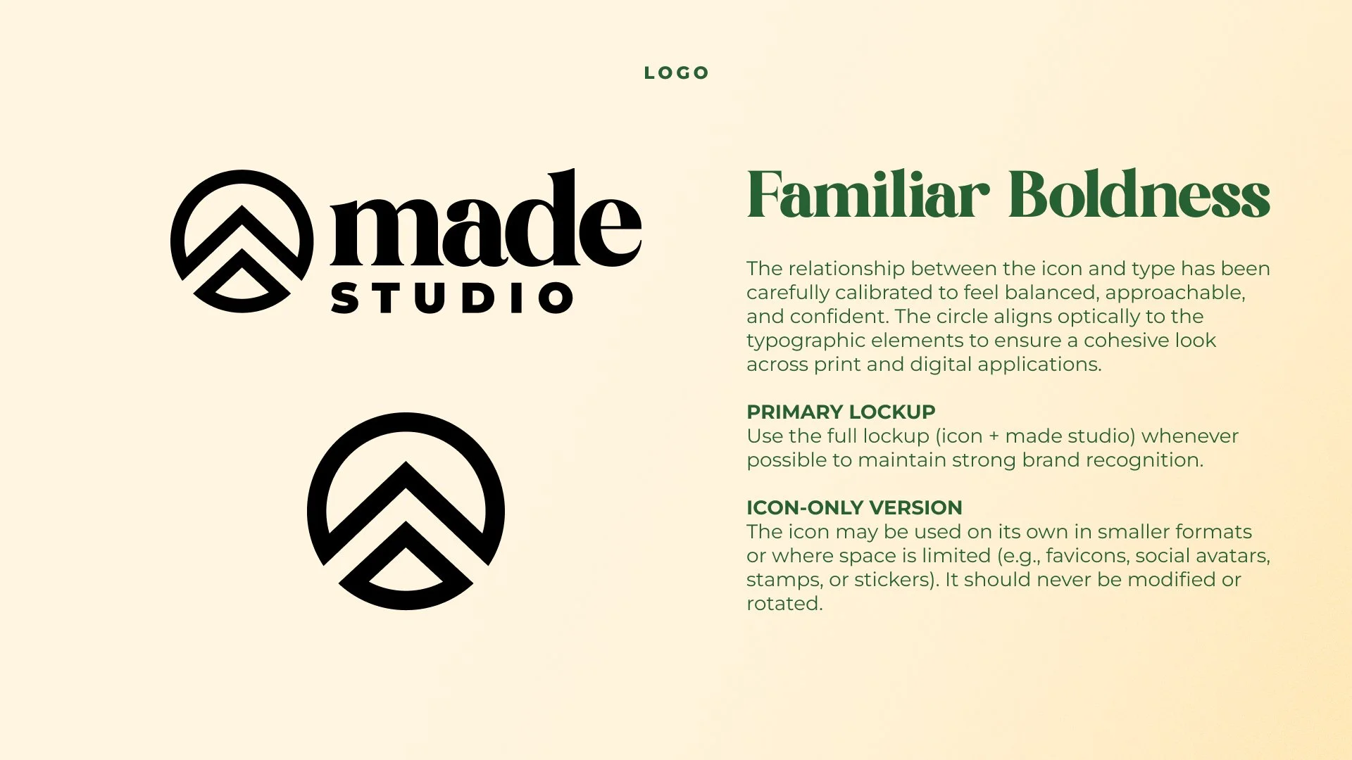
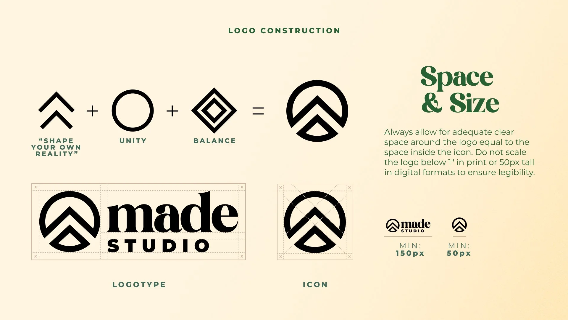
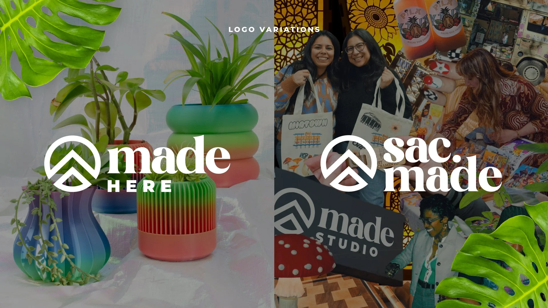
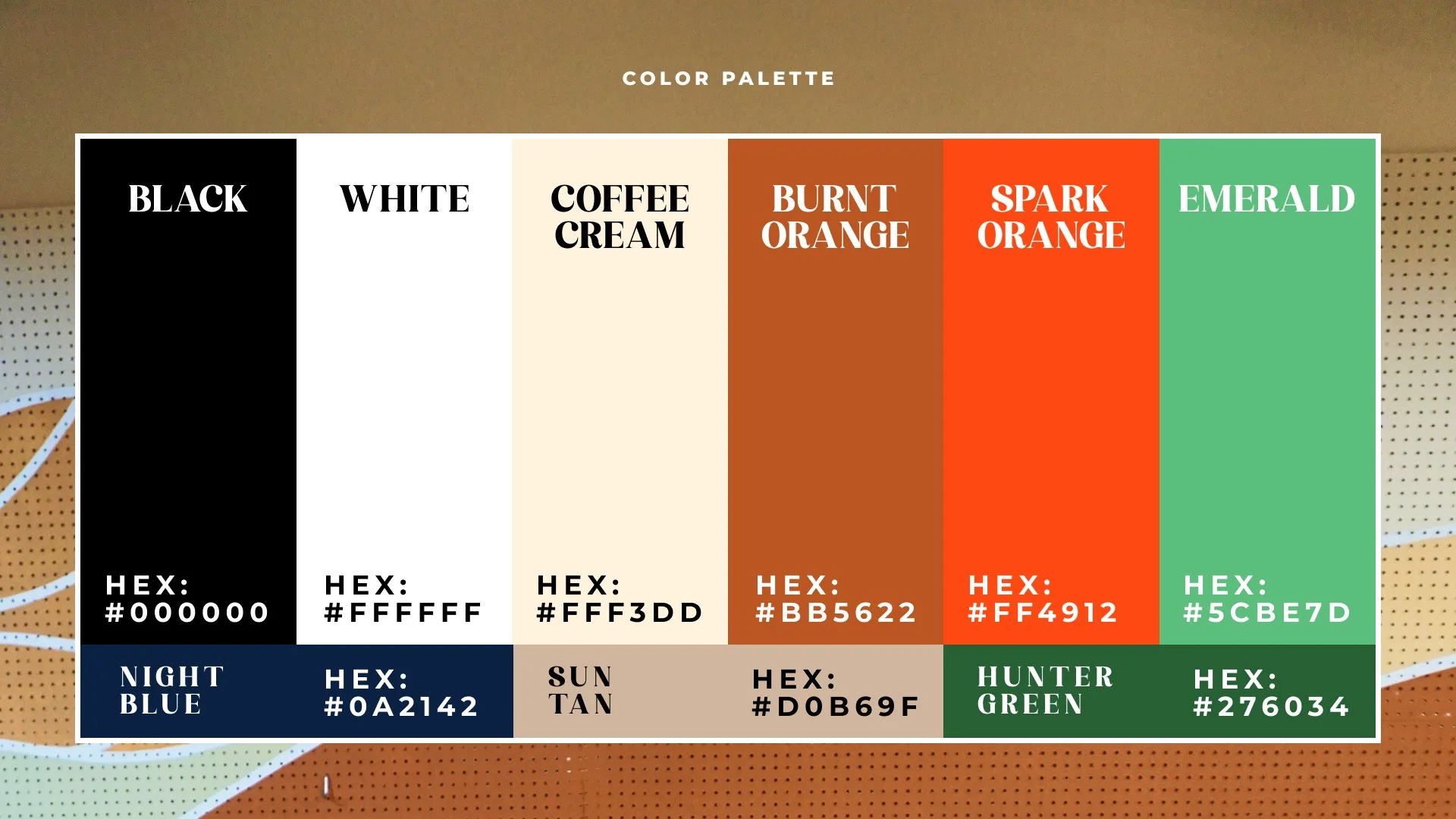
THE Brand guide
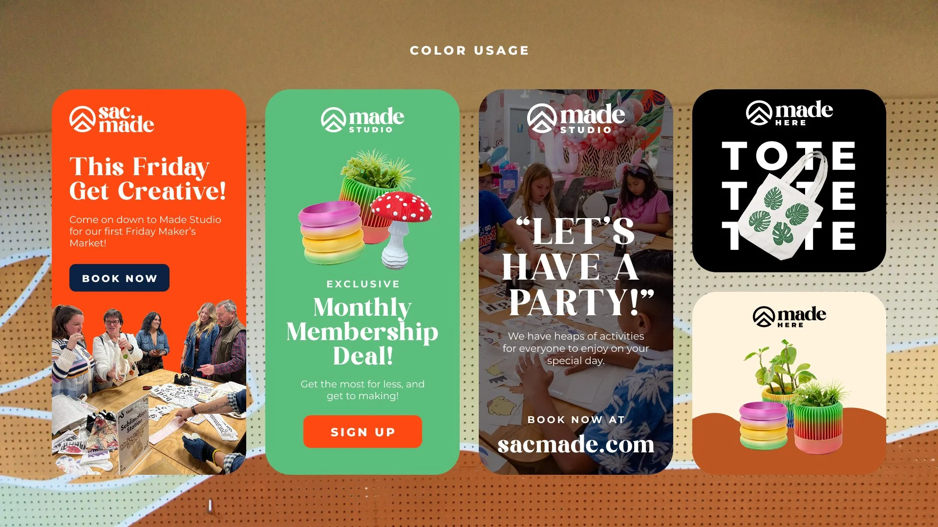
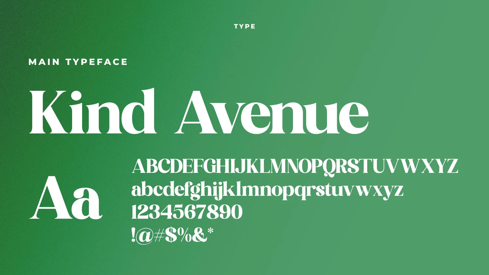
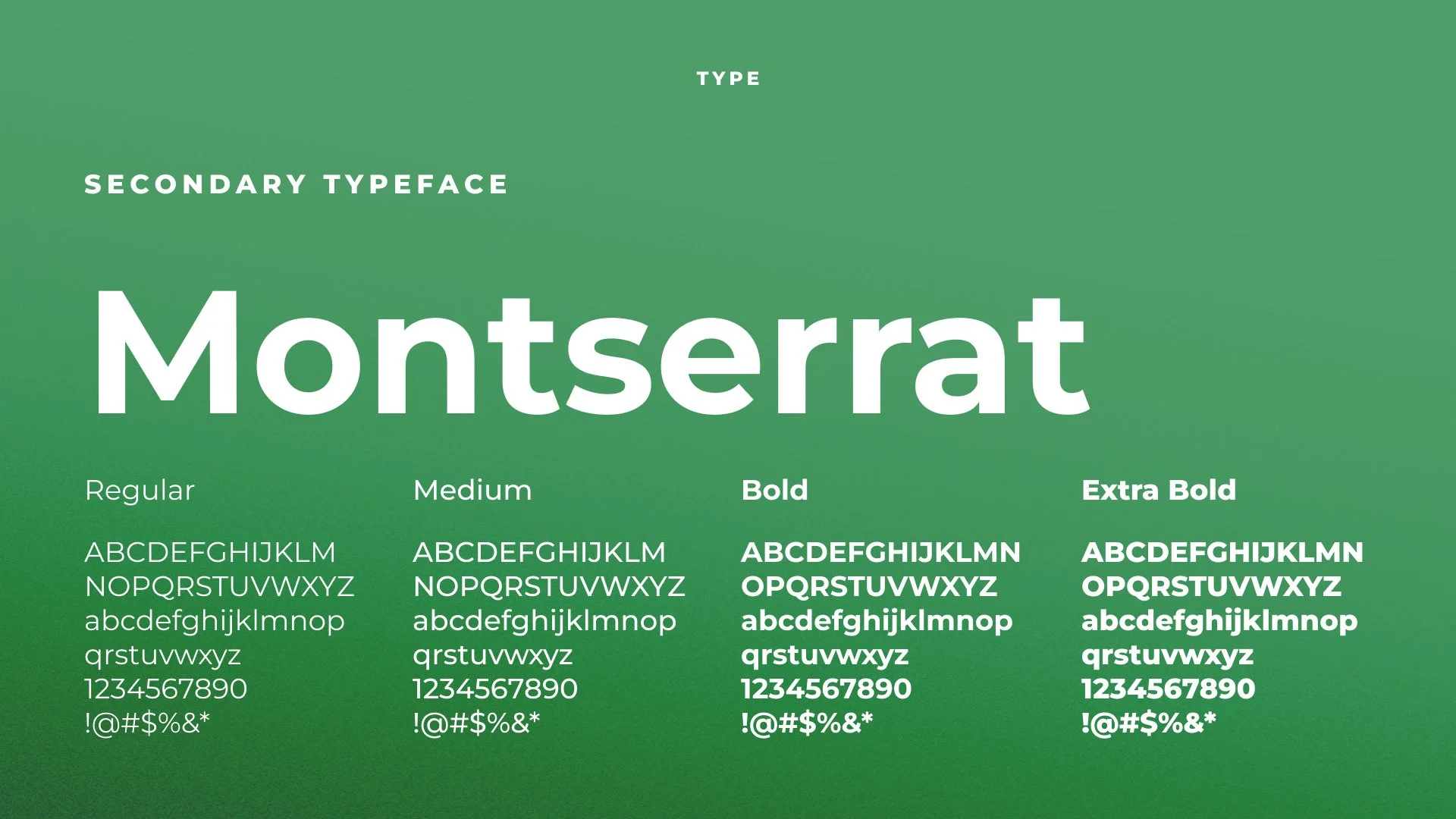
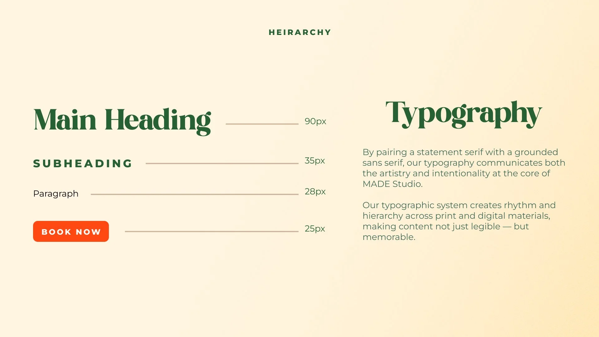
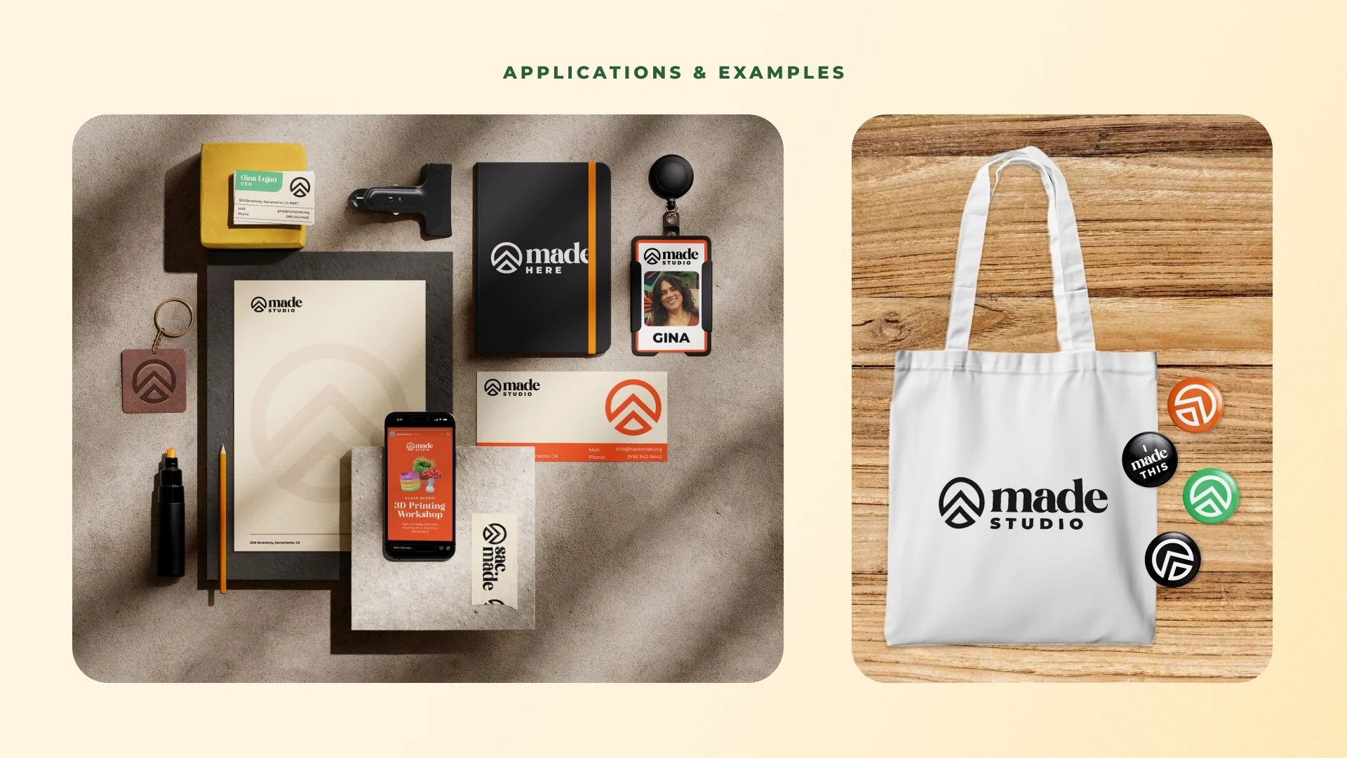
Made is as versatile as its services and community, as such, the guide establishes a flexible system that provides structure and clarity while leaving room to evolve. It unifies Made’s three sub-brands—Made Studio, Made Here, and Sac-Made—through consistent visual and tonal rules, and allows each to retain its own personality. Clear hierarchy and adaptable components make the system easy for team members to use across platforms. Beyond specs, the guide explains the thinking behind key creative decisions like the logo’s symbolism, the energetic color palette, and the imagery centered around makers in action. Together, these elements create a strong foundation for the brand to grow with intention.
THE IMPACT
-
The updated visual system helped reinforce Made Studio as a place where people feel empowered to try new tools, learn new skills, and take creative risks.
-
Members responded positively to the warmth and clarity of the new brand, noting that it felt more reflective of the studio’s energy, purpose, and people.
-
The rebrand established a cohesive system that supports Made Studio’s evolving programs, sub-brands, and digital presence without needing constant redesign.
WeBSITE REDESIGN
We had repeatedly received comments about the difficulty users were having finding class and studio information, which was keeping potential new members from accessing our services. With that in mind, I approached the website redesign with a strong focus on clarity, breathing room, and ease of use for Made’s members and staff. Using Figma, I mapped layouts, user flow, and content hierarchy. I designed a system that feels open and welcoming while making essential information, like membership pricing and community events, easy to find.
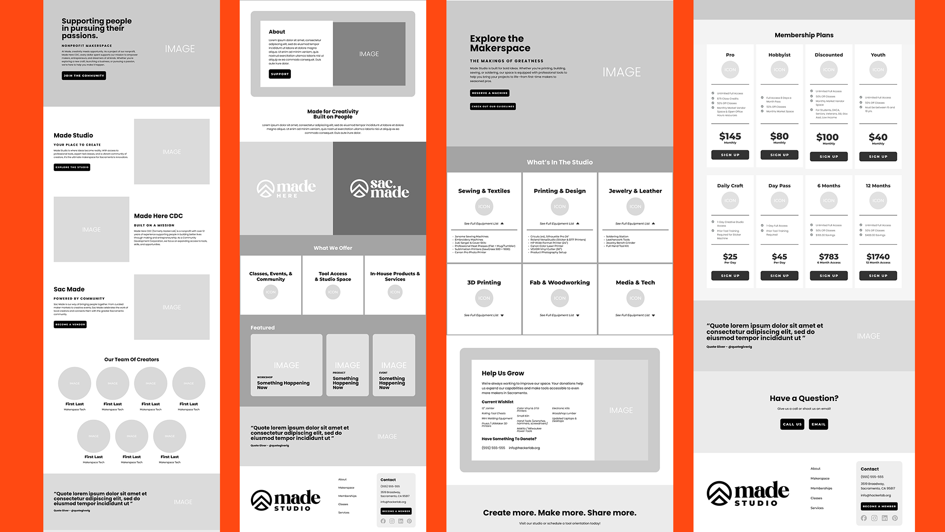
Wireframes
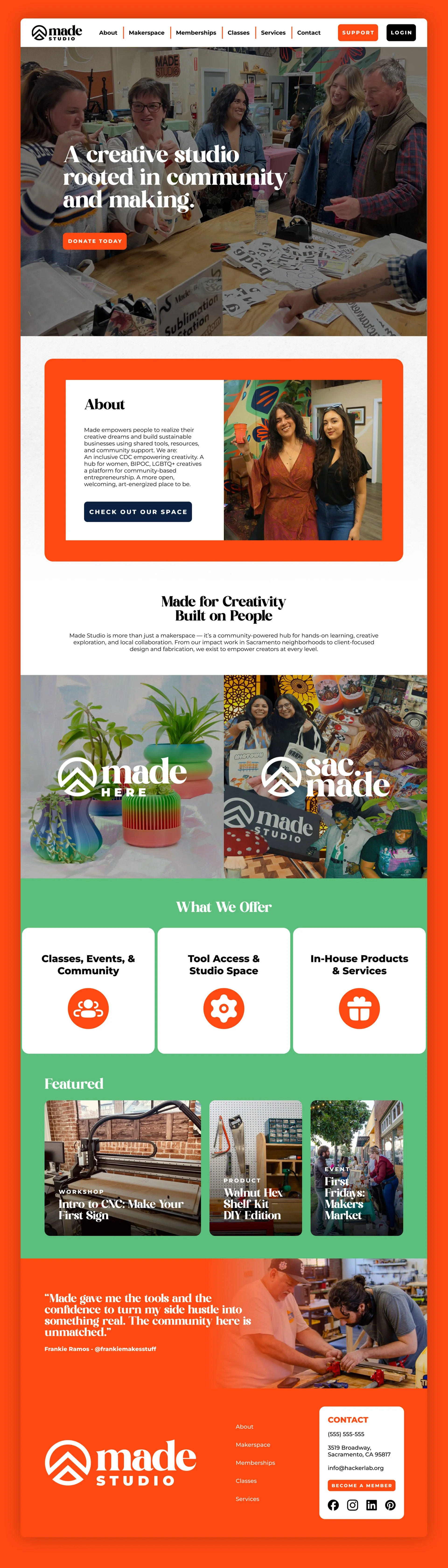
Home Page
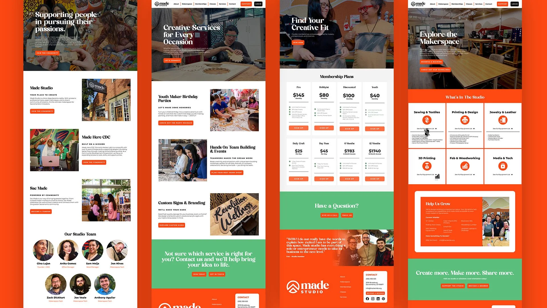
Major Pages
REFLECTION
Working on this rebrand changed how I think about branding beyond surface-level traits like being inclusive or friendly. Digging into Made Studio’s identity pushed me to ask deeper questions about how a space actually supports its community in a practical way that allows them to progress.
I began to see the studio less as a place people visit and more as a resource people rely on. That shift reframed many of my design decisions. The goal became making members feel capable and confident when using the studio, able to find information easily, understand how to access tools, and feel supported in their creative process. At the same time, I wanted the brand to feel like home: warm, familiar, and welcoming without being vague or ornamental.